
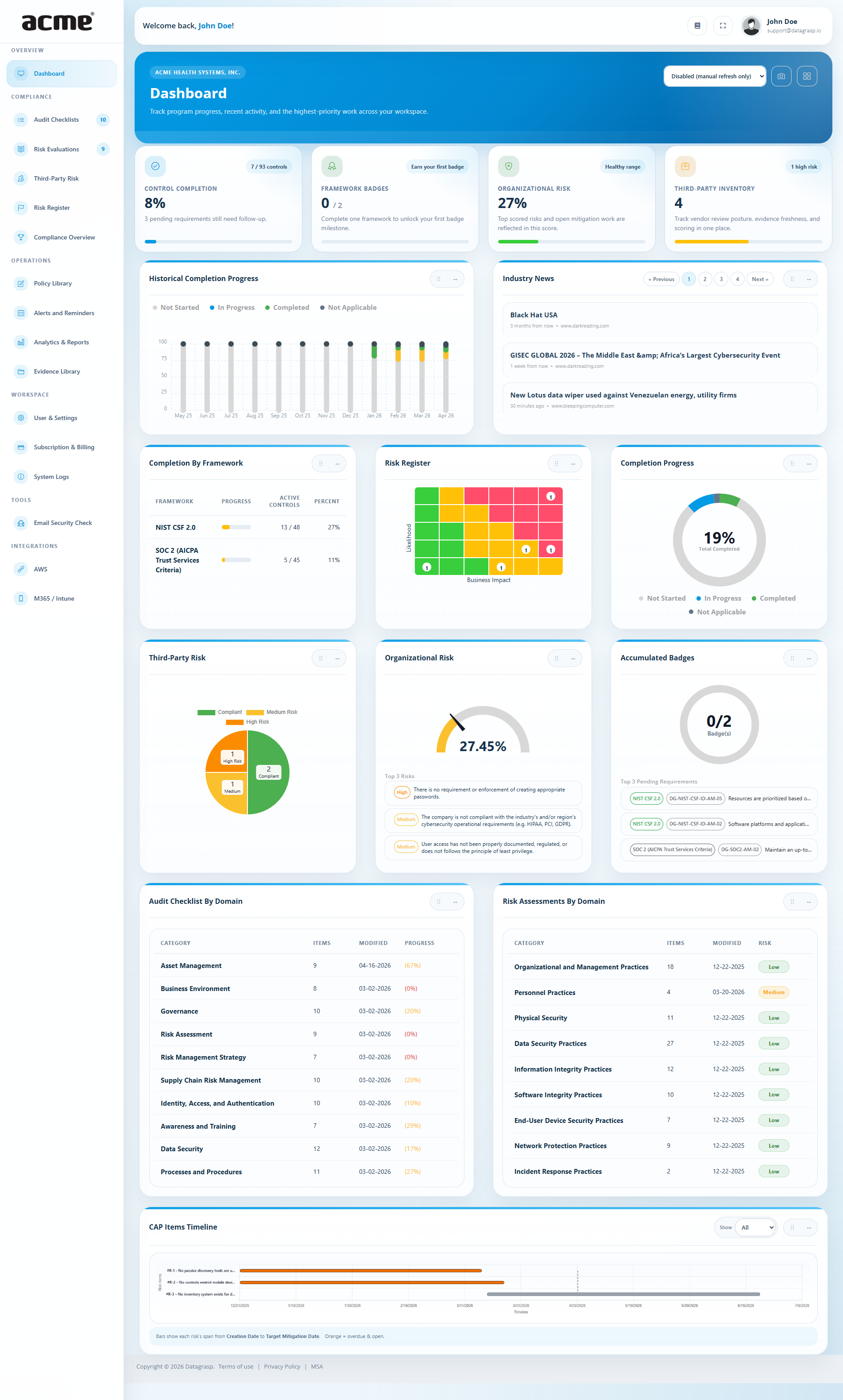
The Dashboard summarizes your Compliance & Risk posture across frameworks, Tabletop Exercises, Third-Party Risk, your Risk Register, badges, and remediation work. It auto-refreshes on an interval so the view stays current while teams monitor progress.
 1
2
3
4
5
6
7
8
9
10
11
12
1
2
3
4
5
6
7
8
9
10
11
12
Restore the default widget order and sizes. Great after lots of drag and resize changes.
Time-series of completion over the last 12 months so you can track momentum over time.
Curated security and compliance headlines to help teams stay aware of relevant developments.
Side-by-side progress for HIPAA, NIST CSF, CIS, PCI-DSS SAQs, GLBA, ISO/IEC, and other supported frameworks.
Heatmap counts by Likelihood x Impact. Click a cell to open the register filtered to matching risks.
Single percentage across selected frameworks that reflects control status and mapped evidence.
Snapshot of vendor status, evidence currency, and third-party risk posture from your TPRM data.
Gauge uses your cached organizational risk score and highlights the most important risk drivers.
Summary of earned framework badges versus remaining opportunities to complete more.
Progress for each control assurance domain, including item counts, modified date, and completion percentage.
Domain-level averages for Probability and Impact, shown as Low, Medium, or High.
Timeline view of corrective action plan items so teams can monitor remediation activity and pacing.
1) Reset Dashboard View to Default
Use this option to return your dashboard to its original configuration. It resets filters, chart views, and widget placements to the Datagrasp defaults, ensuring you always have a clean starting point for monitoring compliance and risk.
- When to use: After heavy customization or filtering that makes navigation difficult.
- What resets: Filters, time ranges, widget order, and temporary preferences.
- What does not reset: Your underlying data, evidence, risks, and audit progress remain untouched.
2) Historical Completion Progress
A time-series that shows how your posture improves over time. This is useful for board updates, customer conversations, and audit readiness reviews because it shows trend, not just a point-in-time status.
3) Industry News
Curated headlines can inform awareness training, policy revisions, vendor discussions, and new risk scenarios. Clicking a headline opens the source in a new tab.
4) Completion by Framework
Compare coverage for HIPAA, NIST CSF 2.0, CIS 8.1, PCI-DSS 4.0 SAQs, GLBA, ISO/IEC 27001:2022, ISO/IEC 42001:2023, SOC 2 Readiness, CMMC Level 1 SAR, NDAA Section 889, and others. Clicking a bar applies a framework filter across the app.
5) Risk Register
A heatmap that groups risks by Likelihood x Impact. Each cell shows how many risks fall into that bucket; clicking a count opens the Risk Register filtered to those entries.
6) Completion Progress
A single percentage that aggregates completion across your selected frameworks. It factors control status, mapped evidence, and framework weighting where applicable.
- How it is calculated: (# completed applicable controls / # applicable controls) x 100.
- Pro tip: Use the Compliance Overview page to see precisely which controls block the next improvement.
7) Third Party Risk
Vendor-focused cards summarize questionnaire status, evidence expirations, higher-risk vendors, and notable third-party changes. Availability depends on your subscription plan.
8) Organizational Risk
The gauge visualizes your cached organizational risk score. Supporting detail highlights the most important factors so leadership can see both overall posture and the biggest drivers behind it.
9) Accumulated Badges
When a framework reaches 100%, its badge appears here for quick recognition and sharing. This gives teams a fast view of what has already been fully completed.
10) Control Assurance by Domain
Ten-domain view across areas like Asset Management, Business Environment, Governance, Risk Assessment, Risk Management Strategy, Supply Chain Risk, Identity/Access/Authentication, Awareness & Training, Data Security, and Processes & Procedures. Each bar reflects checklist completion and attached evidence.
11) Risk Assessments by Domain
Average Probability and Impact by domain, summarized as Low/Medium/High. Use this to compare risk concentrations across practice areas and prioritize governance or technical workstreams.
12) CAP Items Timeline
The CAP Items Timeline shows corrective action plan activity over time so teams can monitor remediation momentum, spot slowdowns, and confirm follow-through on open action items.
Exports, Filters, and Refresh
- PDF / CSV: Where available, use the icons in the header to export the current view for leadership or auditors.
- Global filters: Framework and date filters propagate to cards so you can narrow the dashboard to a program, quarter, or audit window.
- Auto-refresh: Live tiles refresh periodically; charts refresh on change events or manual refresh.
- Drag & resize: Use the dashboard controls to move widgets and set their column span. Your layout saves automatically.
- Reset layout: The grid icon restores the default ordering and sizes.
- Refresh interval: Pick an interval from the dropdown in the header. The dashboard avoids refreshing while you are dragging or resizing to prevent conflicts.